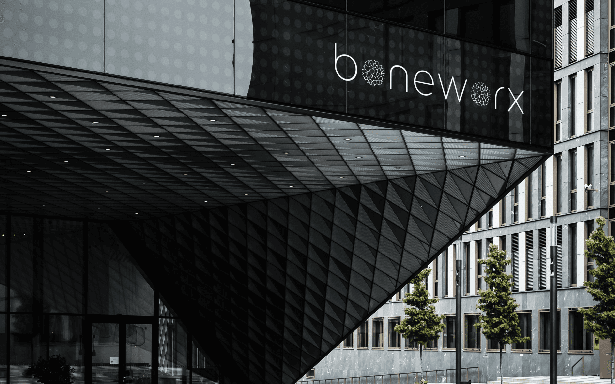
Boneworx
Branding & Corporate Identity
Client
Boneworx
Date
2024
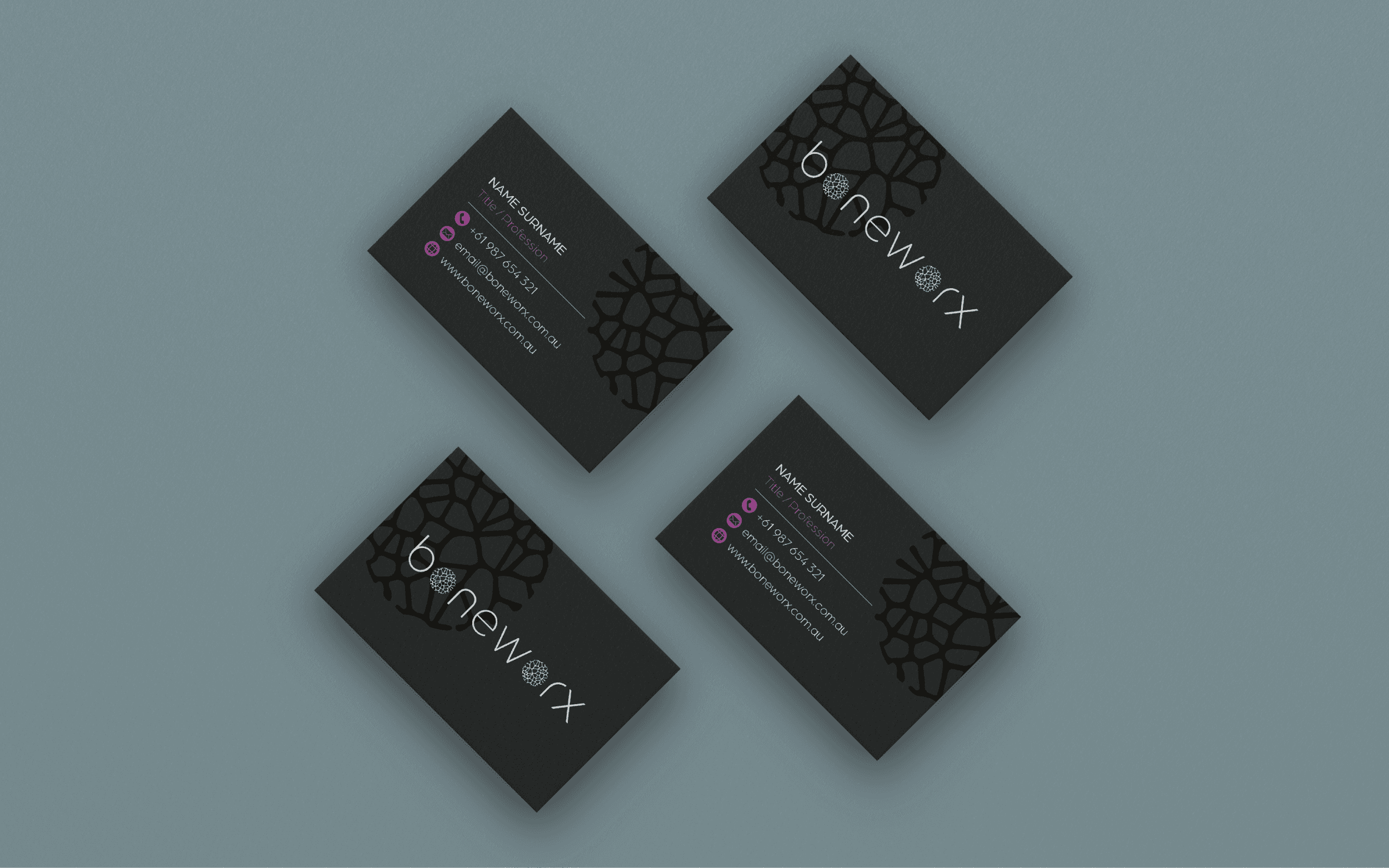
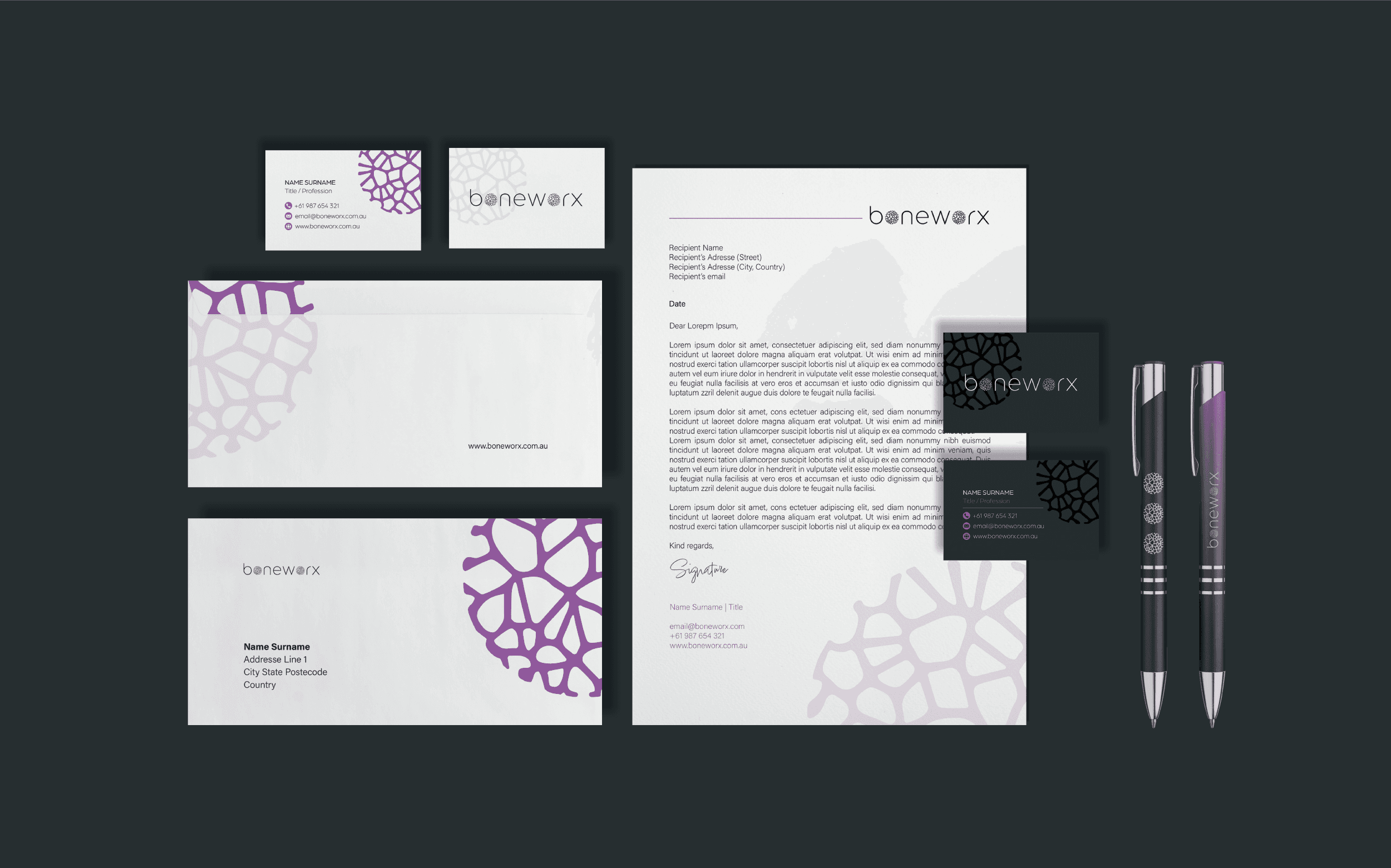
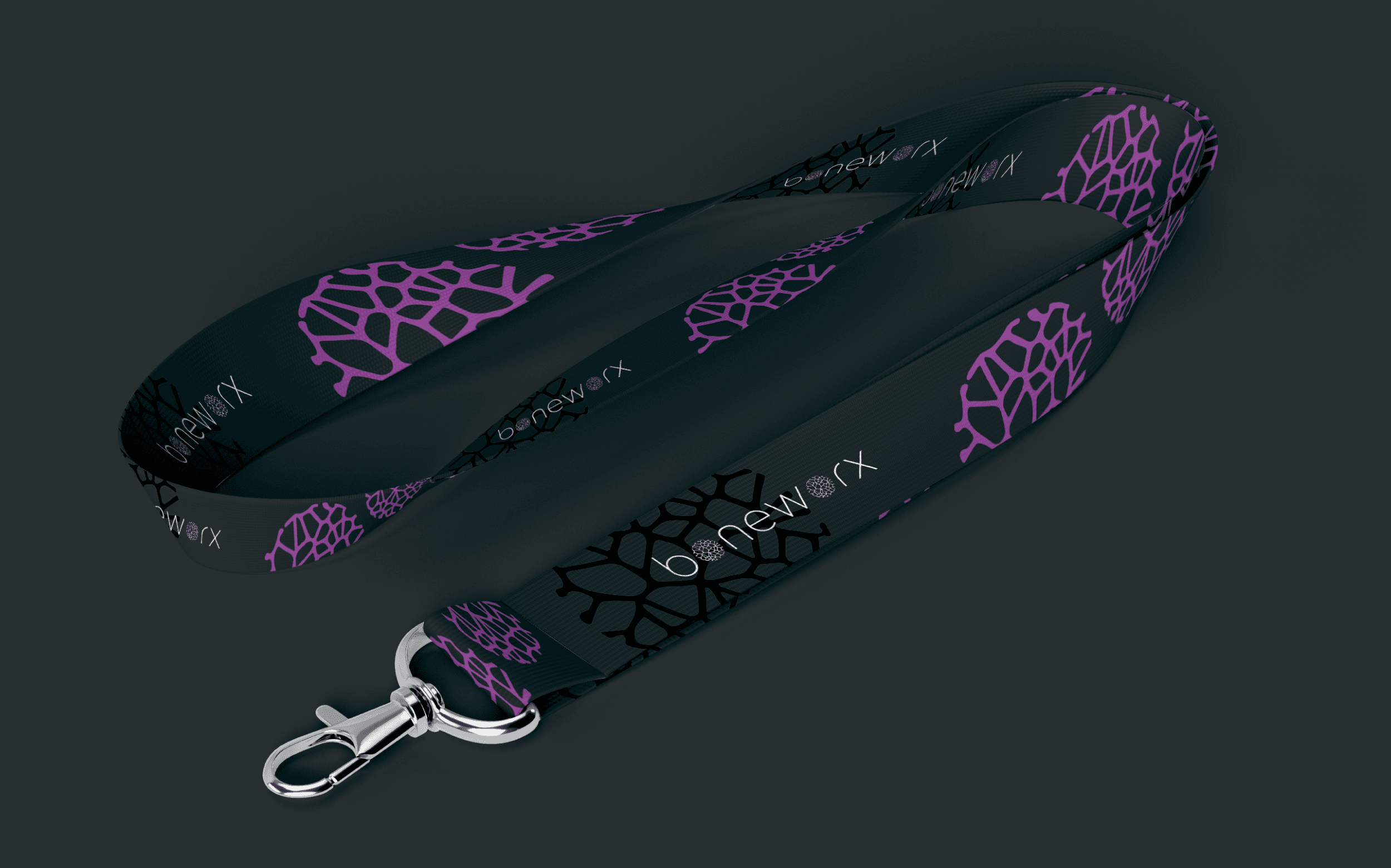
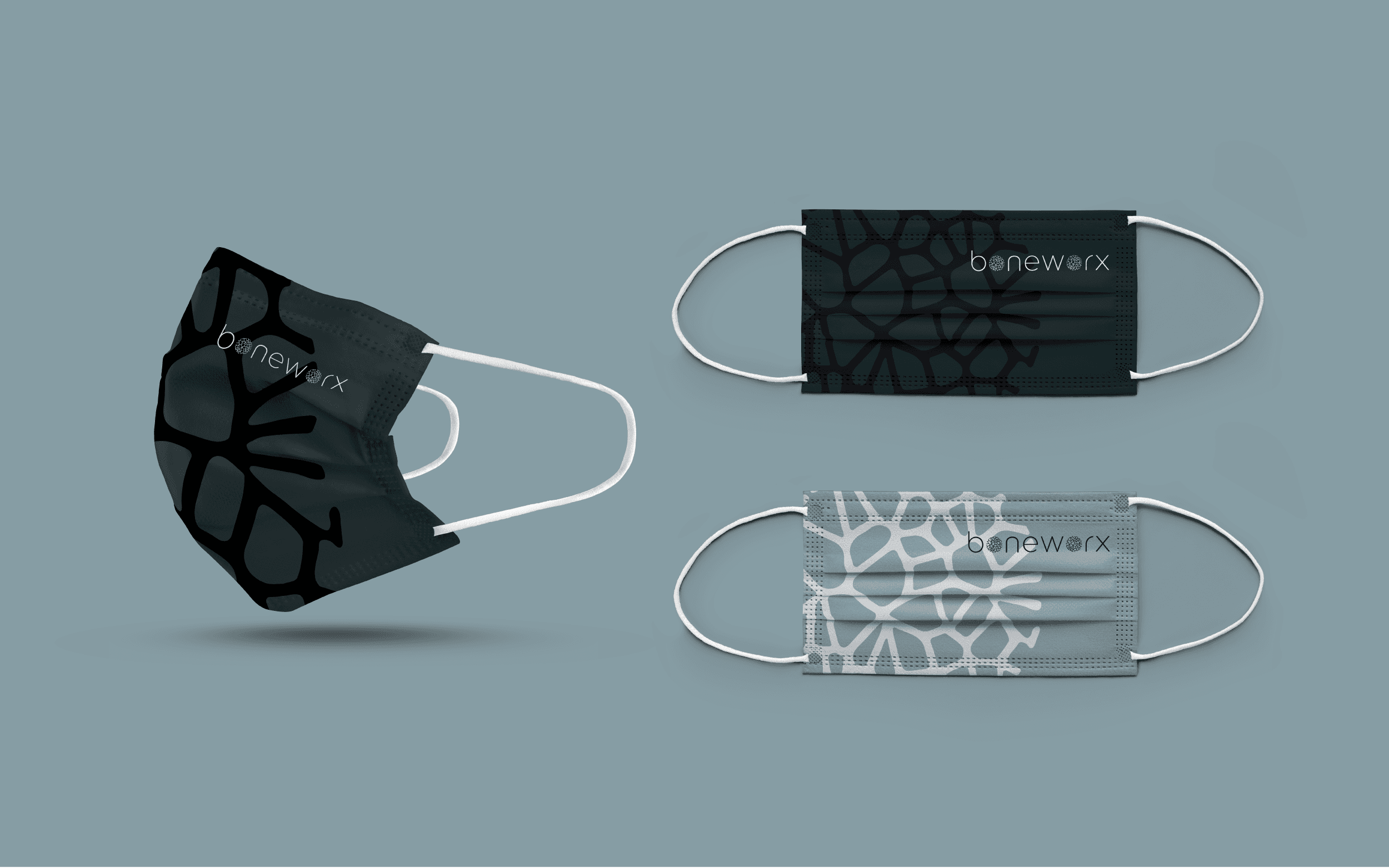
Boneworx, a young medtech company, needed a clean, modern logo that reflects its innovative, patient-specific orthopedic solutions. The design had to convey trust, quality, and expertise while avoiding the overused "medical blue" associated with the industry, opting for a more unique and sophisticated colour palette.
For the Boneworx logo, I replaced the "o’s" with a circular mark inspired by the structure of trabecular bone, tying it directly to their orthopedic focus. The result is a simple, elegant design that captures their commitment to advanced, patient-specific solutions. It’s a distinctive, clean look that reflects the brand’s dedication to precision and quality.
Photography Credits
Piron Guillaume


