Surflab Academy
Logo & Editorial Design
Client
Surflab Academy
Date
2024
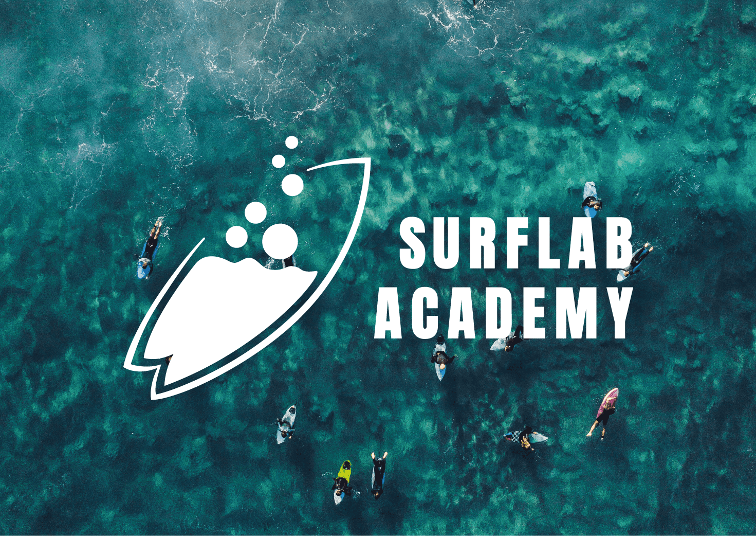
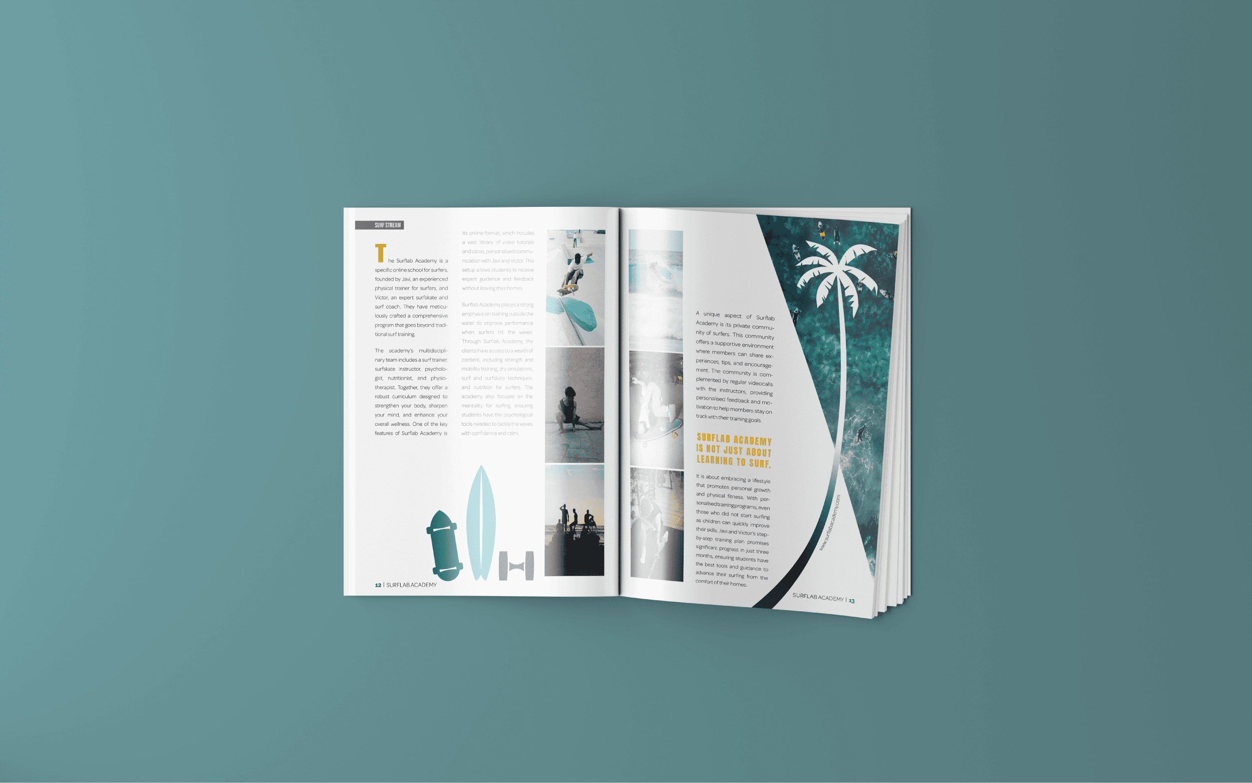
Surflab Academy needed a fresh, modern logo that blends surfing with a science-lab concept, reflecting the out-of-water training approach of their online surf school. It should stand out, no palm trees or waves, yet still feel connected to surf culture and highlight the academy’s innovative, science-driven method.
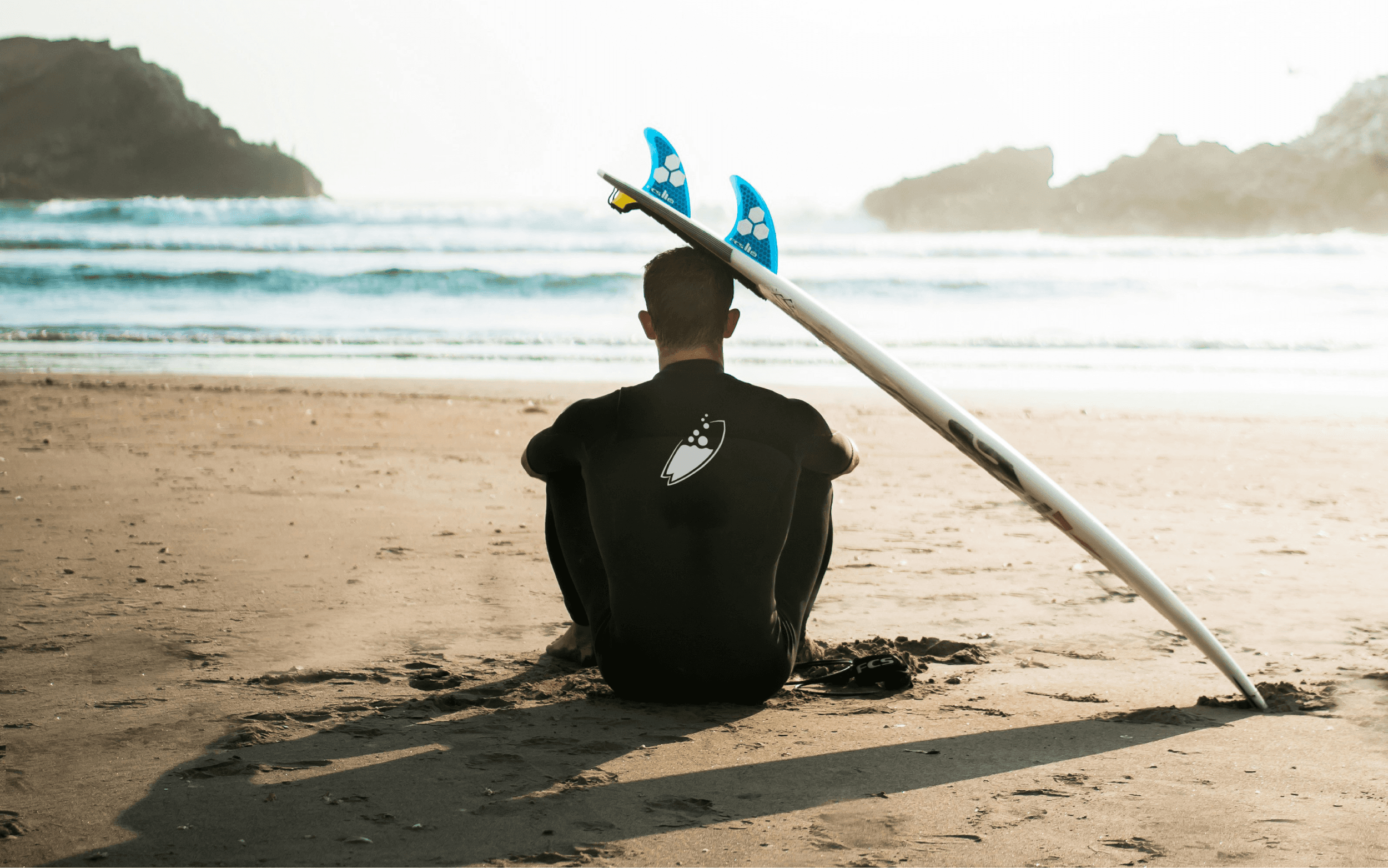
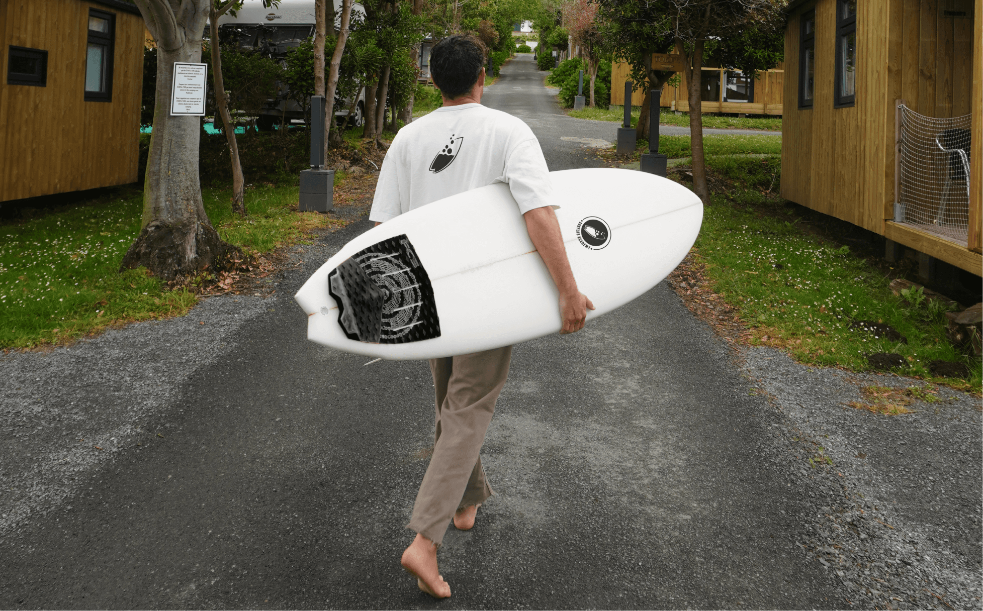
Built from the synergy of science and surfing, it was important for Surflab Academy to develop its own distinct identity while embracing its innovative approach. Drawing inspiration from both the lab and surf culture, the concept reimagines a traditional laboratory test tube and surfboard, blending them into a unified design. By viewing these elements from a new perspective, I created a logo that Surflab can fully own, setting it apart from typical surf logos. The result is a fresh, dynamic mark that represents the academy’s unique, out-of-water training approach while maintaining a playful and fluid character.
Photography Credits
Sebastian Leon Prado, Javi Pola
