R3COVERY
Brand Identity
Client
R3COVERY
Date
October 2025
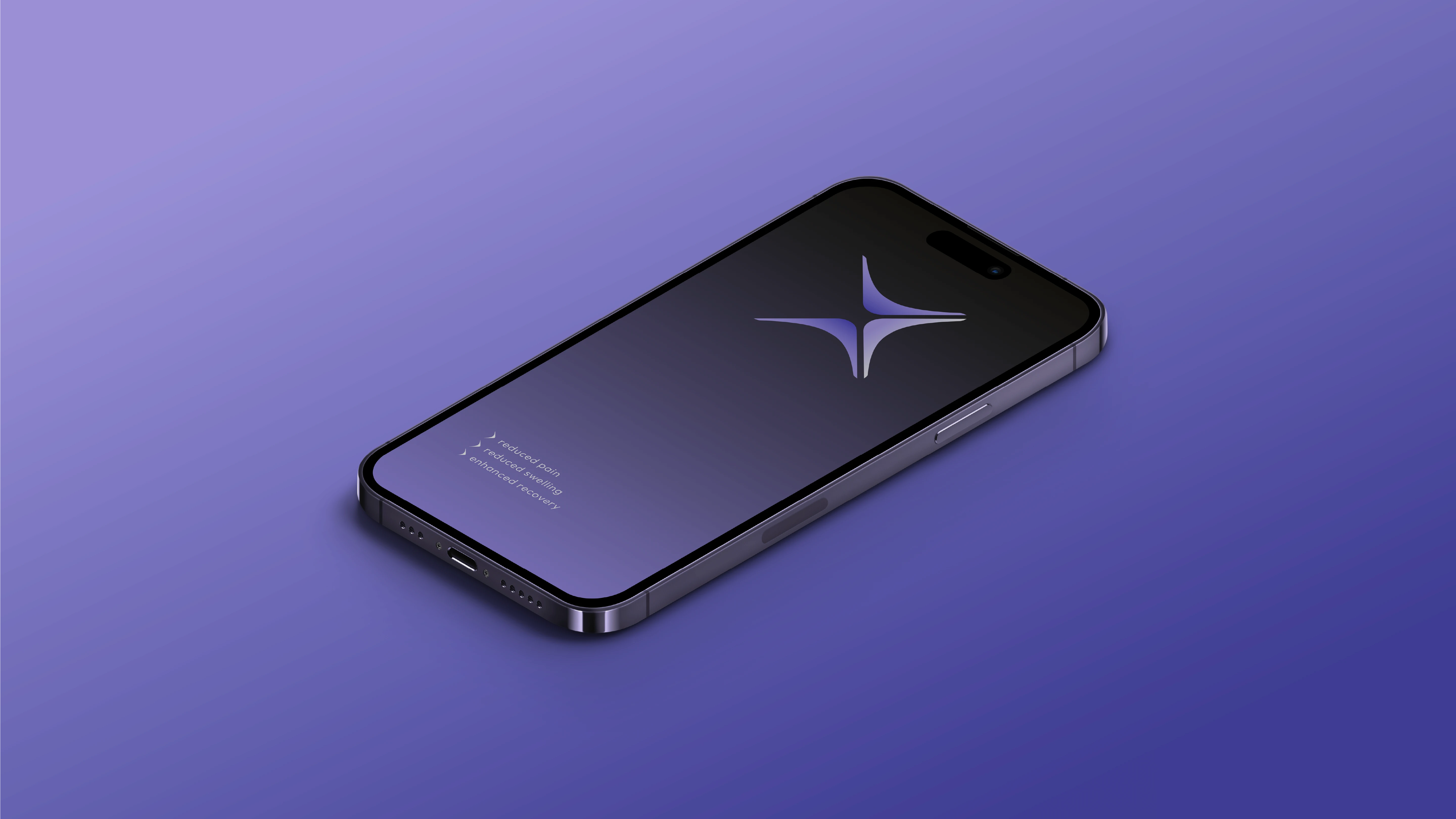
Medical wear that actually looks good? That was the idea behind R3COVERY. A compression wear brand built for people who take recovery seriously, combining medical-grade performance with a design that doesn't look like it came from a hospital shelf.
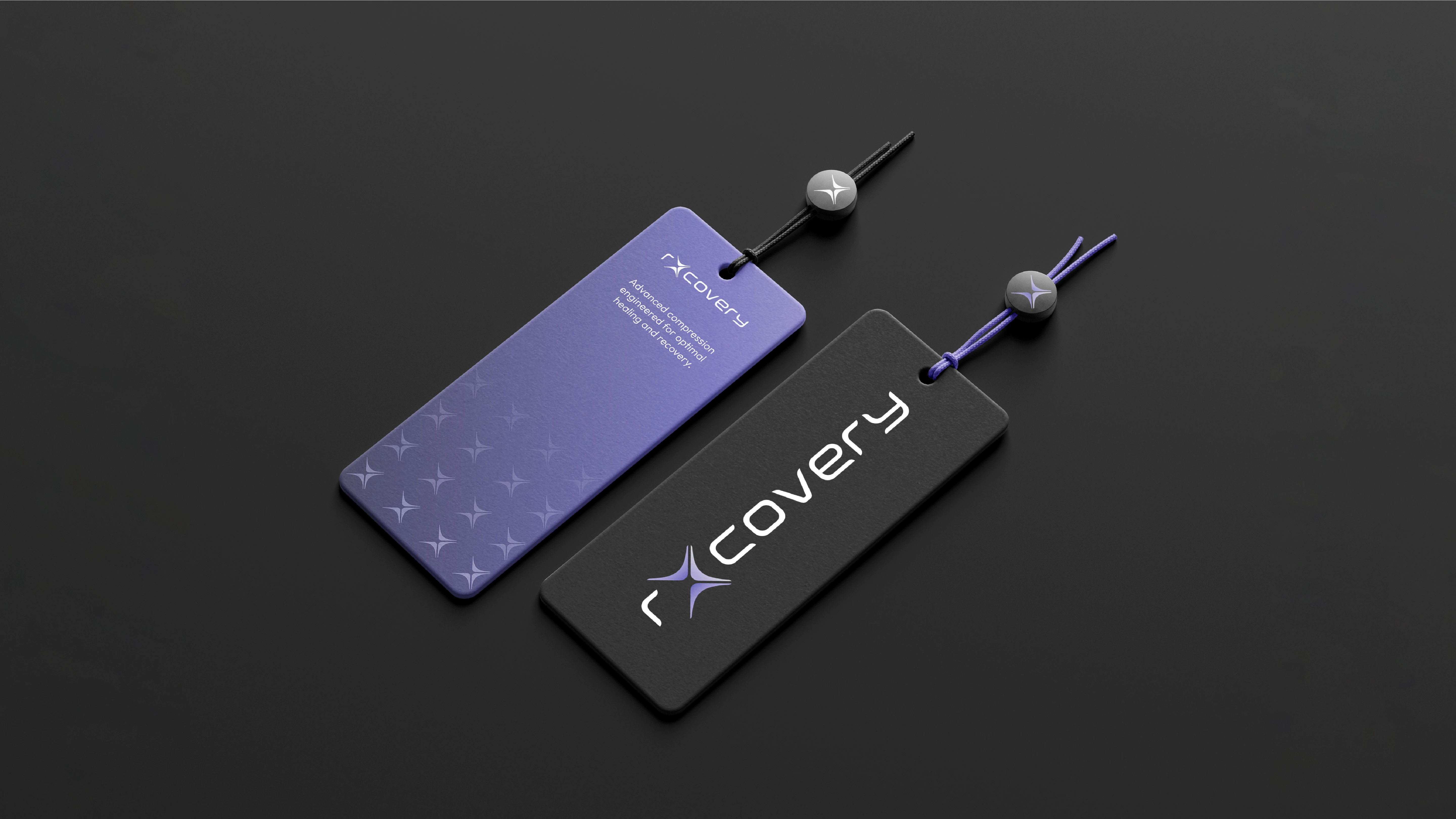

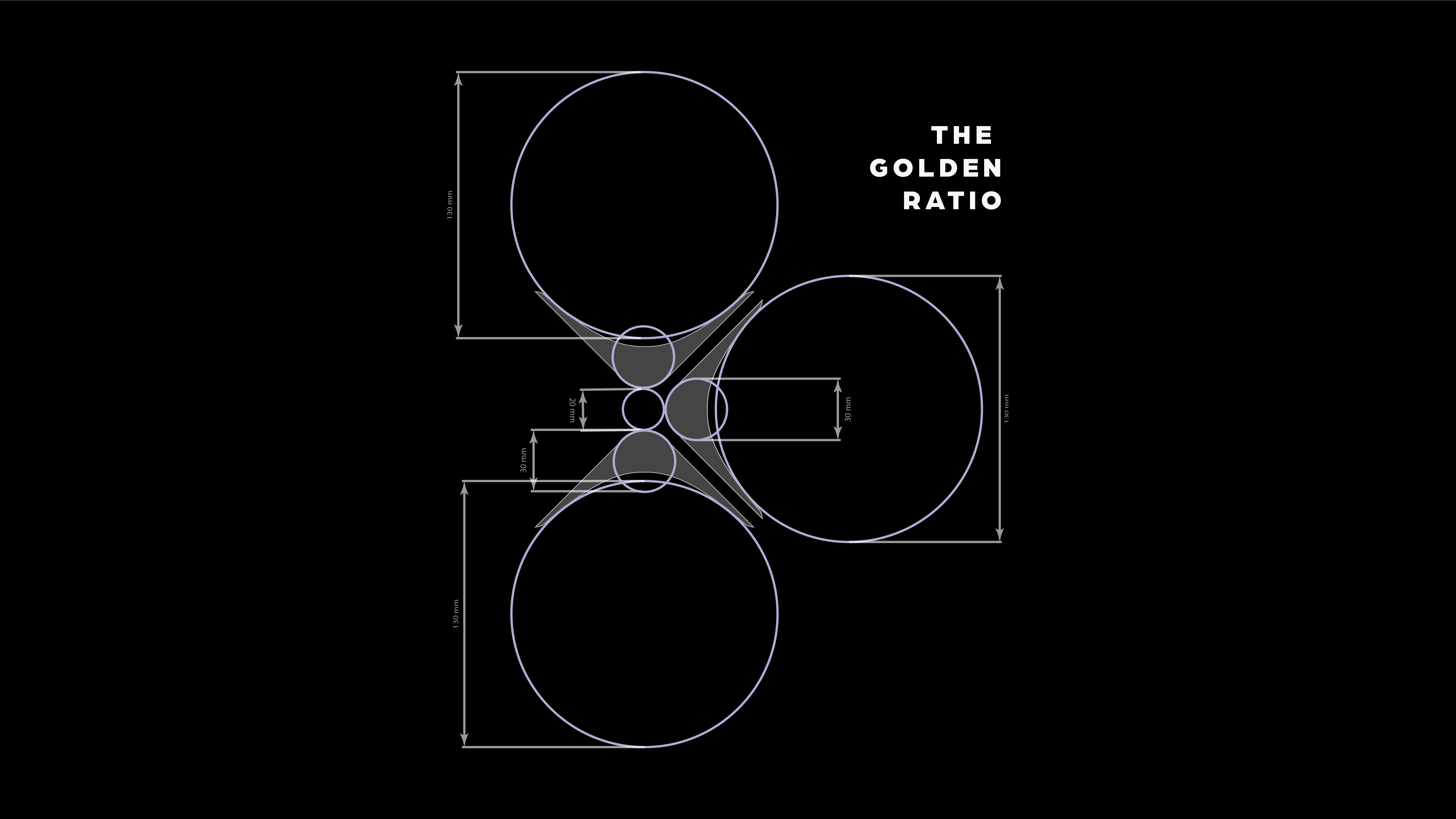
Every element of the mark earns its place. The logo is built around the number three: a deliberate nod to the brand's three founding pillars: reduced swelling, reduced pain, and enhanced recovery. Its form is inspired by the 4-way stretch of the compression fabric itself, with three boomerang shapes coming together to create the mark. Like a boomerang, recovery is about returning, coming back to strength after facing something hard. The subtle X woven into the composition adds one final layer: a quiet reference to Rx, the universal healthcare shorthand for treatment, grounding the identity firmly in its medical roots.